How much to study? and why? must be have same question right. So the topic of the blog is Scientific Analysis of Byju’s Logo. Byju’s is one of the company that provides education solutions to number of students.

The motive of the brand is to assist student regarding their studies. Just as an education institute works similarly the Byju’s works.
They conduct class on different subjects and for class divisions. They also schedule, various revision session as well, which helps students to sharp the memory of previous session.
For around seven days Byju will allow you to access the learning material for free, after seven days you can choose the subscription plans as per you convince.
Byju, was created with an intention of making learning process easy and convenient for the students. They made used of creativity and innovation set up this platform.
Byju works on interactive session where students can talk to teachers and can solve their queries. It has best and experienced teachers to frame the session.
It covers the syllabus of State Board i.e., CBSE, and ICSE. The app also has feature where parents of the students can access their kid’s performance, based on the test series.
Not only for school children, Byju provide course even for those students who desire to appear for different competitive exams like JEE, NEET, and so on.
Thus, Byju has changed the education industry, by showing the power of technology, which can make education more exciting and fun learning, for students irrespective of age.
History and Evolution
The Byju was established by the renowned mentor, Byju Raveendran in the year 2011. He currently lives in Kerala and is also entrepreneur. He use to skip classes and then use to do self studies at home.
In the year 2015, Byju had set up a application, which features personalized learning process. Byju also gained sponsorship and investors, who would invest in the Byju brand for their growth.
Byju also purchased various education platform online like Tutor Vista and Edurite, which would help them earn partnership and to keep updated regrading the content.
Thus the brand would continue to bring technological advancement in their application to make learning more engaging and fun.
How did the brand changed the logo?
Byju brand has changed the logo only twice. Let\’s analysis both one after the other.

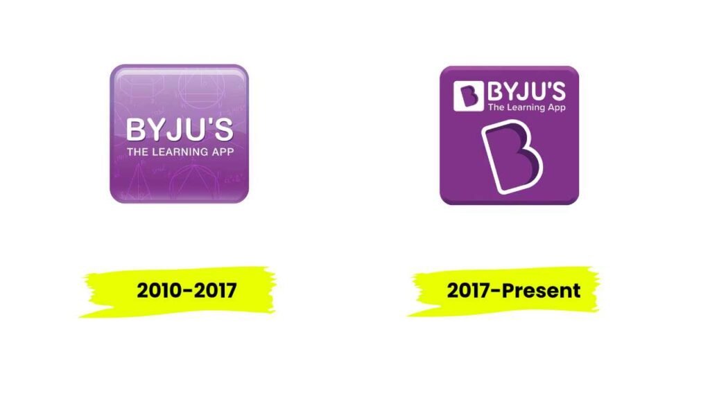
2010- 2017
The initial logo was drafted in the year 2010, which also marked the initial years of the Byju. The logo consisted of wordmark Byju all in uppercase along with subheading The Learning App written in sentence case.
The font used for wordmark was sans serif. The whole wordmark was placed in placed in a box of purple colour and had slightly rounded corners. Box also featured some design of geometry figures in transparency.
2017-Present
Brand decided to change the logo in the year 2017. Most of the elements in the logo were untouched as only minor changes were done.
The new logo consisted of same wordmark and same colour designed box. The geometric figures in the box were eliminated.
Instead the initial letter B was designed and placed in the box towards the left of the wordmark. The letter B was placed in small box of white box and b was coloured in purple. The font used for wordmark was sans serif.
Colour and Font
The colour purple and white are the two primary colour used in the logo. The purple colour is closely associated with intelligence, cleverness, and mystery.
While white stand for purity and clarity, loyalty and honesty. This is perfect colour combination for educational brand as it reflects knowledge vision of the brand.
Thus, brand colour palette is perfectly suitable for brand as it very carefully and tactfully chosen for the logo design.
While the primary font used in the logo is sans serif, which suggest professionalism of the brand.
Confusion and Uncertainty: The combination of red and blue in purple can create a sense of confusion or ambivalence, especially if the color is used excessively or inappropriately.
Conclusion
Thus, Byju logo is righteous designed to be iconic and identical. The design of the logo is been made after very well research and analysis.
The logo of the Byju speaks about the aims of Byju that it will try to improve their service so that learners can get better experience.
